_01_Standard.png)
MWG Brand and Style Guide
This brand and style guide is used to ensure that the MyWebGrocer brand stays clean, consistent, and awesome. This document will go over everything from colors and logo placement, to typography and photography, all with examples.
What is MWG?
MyWebGrocer offers the only complete Digital Experience Platform for grocers and Consumer Packaged Goods brands. The platform powers every interaction to attract, engage, transact and retain grocery shoppers through digital offerings ranging from planning and shopping platforms to mobile and social tools. The company also offers opportunities for Consumer Packaged Goods brands looking to reach consumers with relevant advertising, promotions and offers throughout their grocery path to purchase.
Founded in 1999, MyWebGrocer manages digital solutions for more than 130 retailers across the globe, representing more than 10,000 stores, and 500+ major consumer packaged goods brands.
How to Use This Guide
This guide is here to provide a framework on how to use the logo, colors, typography, and imagery to help communicate and portray brand identity. Provided in this document is a collection of core elements that come together to create the MyWebGrocer distinctive look and feel. These elements will help the MWG identity stay easily recognizable, yet assist you in creating effective and compelling communication with a touch of creative flexibility. In addition, you can use this guide to ensure that you have the most recent files and newest icons.
MyWebGrocer Logos
The MyWebGrocer logo comes in two main variations. The first is our primary logo and it is in green and dark gray lettering. This logo is used on a white background. The second is a reversed out version of our logo contained by a dark gray box. This logo is used over images and other gray boxes. The final is a one color example and is to be used for one color jobs. View the examples page to see how the logo can be used.
The following logos are low resolution and perfectly suited for usage on the web and for usage in programs such as PowerPoint and Microsoft Word. If you require a "hi-res” version for printing (e.g. a publication, banners), please email graphics@mywebgrocer.com.
_02_Reversed.png)
_05_Gray.png)
Thank you for not editing, changing, distorting, recoloring, reconfiguring or otherwise modifying the MyWebGrocer logo!
Logo Clear Space
When using the MyWebGrocer logo, please ensure that you leave enough space around it. Use your best judgment when using our logo with other elements.
Typography
We primarily use the Gotham font family. It’s elegant, clean and has a wide variety of styles to choose from. Depending on where it will be used, there are different typefaces to choose from.
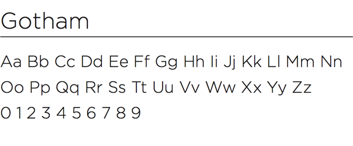
Gotham is our primary typeface used for display and text. Usages include: print in publications, flyers, onesheets, tradeshow materials.
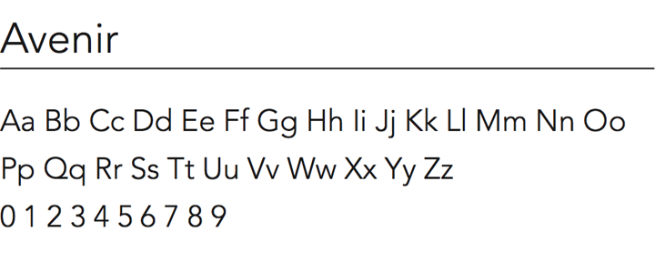
Avenir is our secondary typeface used mainly as a display font. Usages include: headlines, signage, banners.
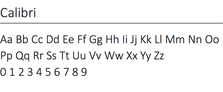
Calibri is a clean sans serif typeface and is generally available on most computers, which makes it a good “company-wide” font. Usages include: PowerPoint decks, Microsoft Word and Excel docs.
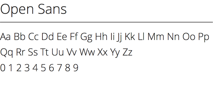
Open Sans is MyWebGrocer’s web safe typeface. Where Gotham and Avenir are NOT web safe, Open Sans does the job where the others are not safe.
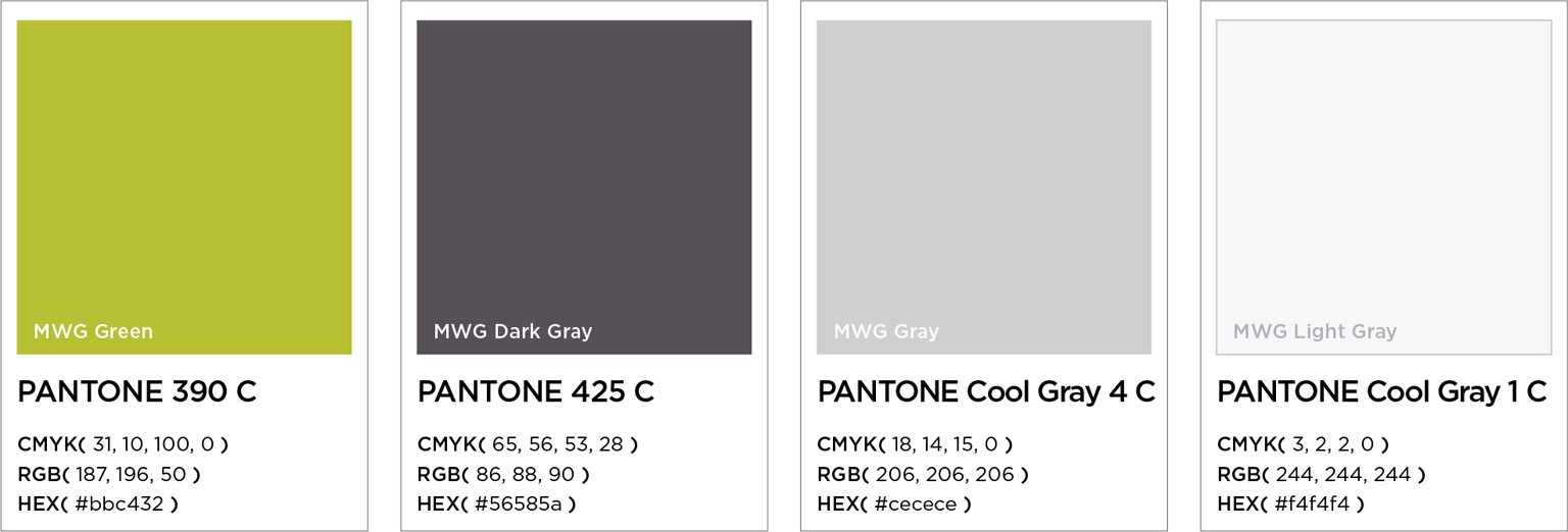
MyWebGrocer Colors
These are MyWebGrocer’s primary corporate colors. The main color palette contains our light green, dark gray and light grays. Use the indicated Pantone, CMYK, RGB or HEX code!
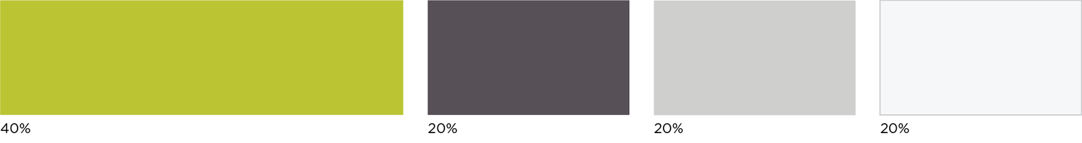
Color Percentages
To help keep the MyWebGrocer brand as consistent as possible try to utilize the correct proportions of our colors.
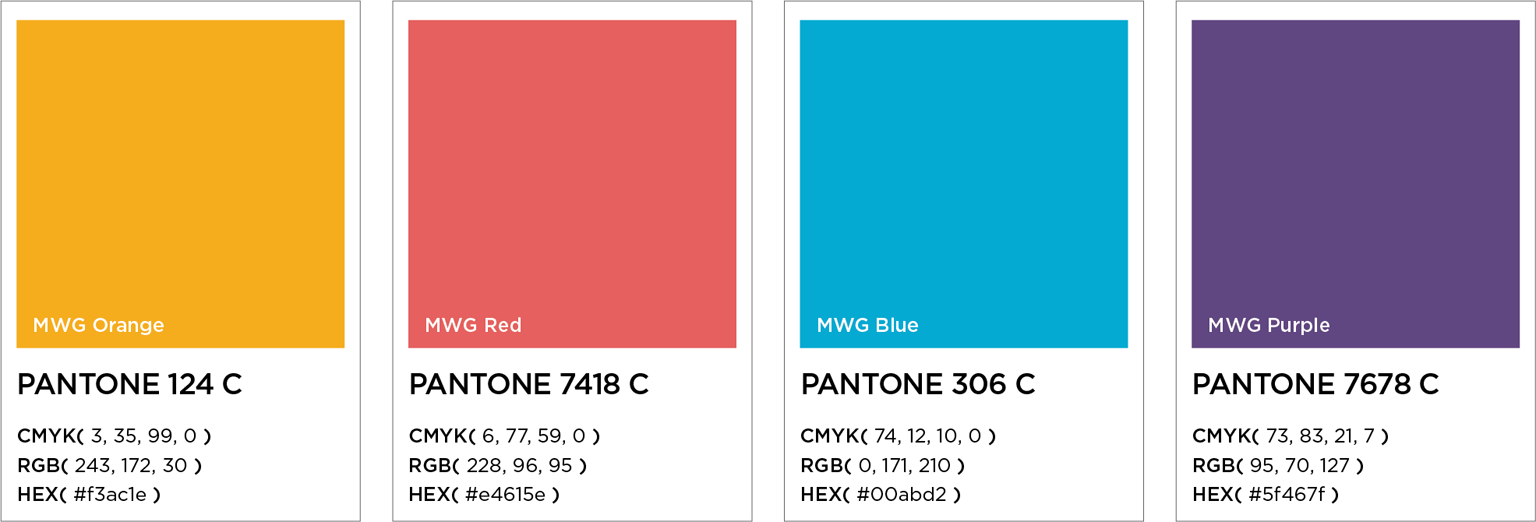
MyWebGrocer Secondary Colors
Sometimes, we can have even more fun with our colors. To help have more engaging presentations, we have the ability to use a wider color palette. Use these colors to add a bit of accent and emphasis in your presentations!
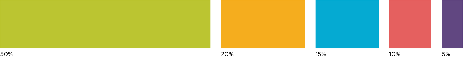
Secondary Color Percentages
Green is our primary color and is still to be used a majority of the time. However, to keep the green from becoming monotonous, splash in some orange and blue. Green, orange, and blue are the colors of choice, but you can branch out to the red and purple as well.
Iconography
Our message is straight to the point, so too are our graphics. Our iconography is geometric and bold. To keep all of our brand and icons familiar, please ensure that the icons all stay the same size and are not distorted.
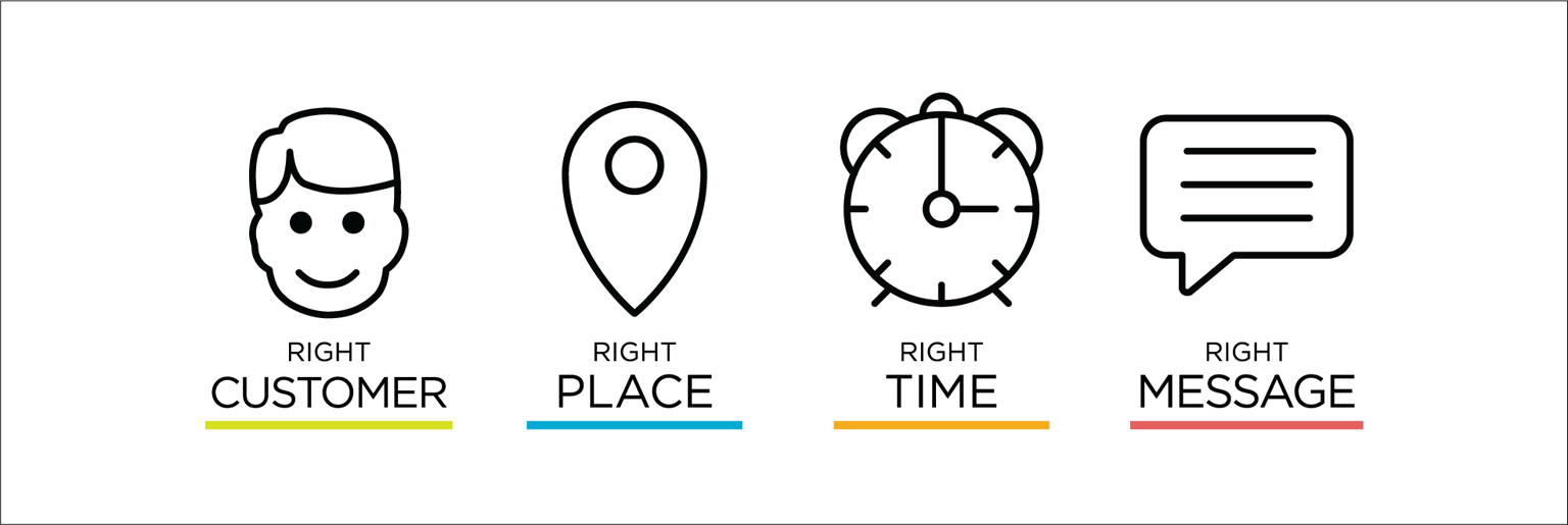
Use an icon with color and add a little extra pop to your presentation.

To view all of the current icons, please click the button below. You can either download the icons individually or together in a zipped file that contains all of them.
Photography
Sometimes iconography just doesn’t quite cut it. We use imagery in our advertising and marketing to help our users connect and relate to the message. We primarily use images in conjunction with text so occasionally we will utilize colored bars to help the text stand out. The MWG logo almost always appears over a solid color, white, gray or black.
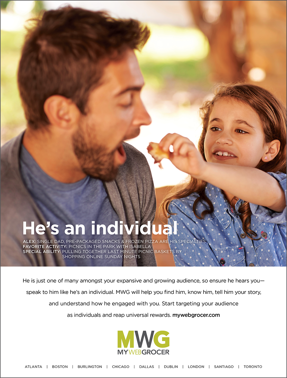
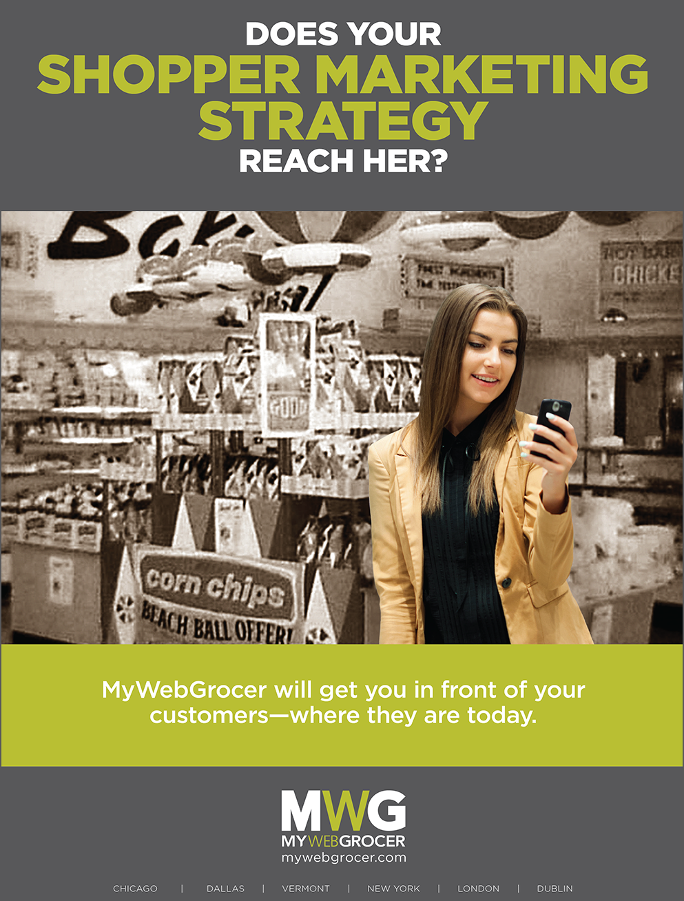
Examples
Here are some additional examples of our corporate branding. You can see how the logo, typography, colors and imagery all comes together for a clear concise style.
Presentation Examples
Here are even more examples of our corporate branding with a splash of color. Notice how the colors are not overpowering, but just add to the interest.
You can see how we use colors...
... and text ...
... to help bring everything together!
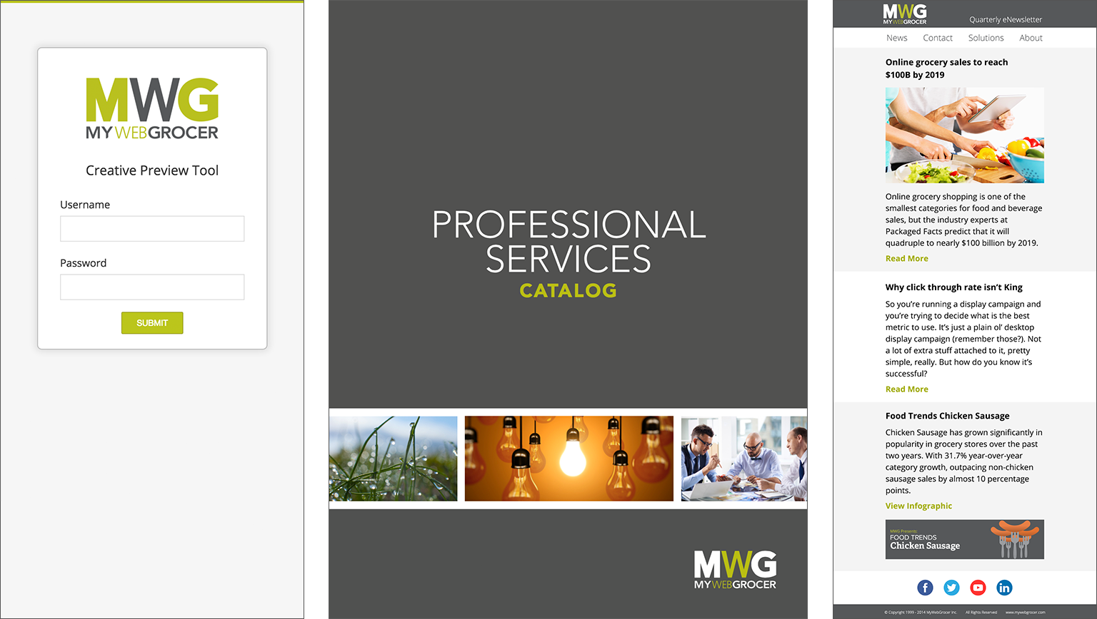
Additional Resources
Included here are a few additional resources that you can download.
Conclusion
Thank you for spending the time to familiarize yourself with the MyWebGrocer Brand and Style Guide. If you have any questions or concerns please contact the Design Team by emailing us at design@mywebgrocer.com.
For creative requests, please email graphics@mywebgrocer.com. Please include detailed information regarding the job and a realistic due date.